13/09/2023 - 09/09/2023 / Week 6 - Week 7
Dow Jia Zheng - 0354184 / 040604-14-1581
Advanced Typography / Bachelors of Design in Creative Media / Taylors Lakeside
Campus
Task 2 / Key Artwork & Collateral
LECTURES
AdTypo_5_PerceptionAndOrganisation
Perception is "the way in which something is regarded, understood, or
interpreted". So, is perception what you se---or what you see are
manipulated into seeing and understanding? As often time in any graphic
design and advertising a lot of what people see and also understand is us
manipulating them into seeing and understanding.
Perception in typography deals with the visual navigation and interpretation
of the reader via contrast, form and organisation of the content. Content
can be textual, visual, graphical or in the form of color. However our focus
today is in typography.
So how does contrast work? And what does form entail?
It very difficult when talking about perception organisation within a
layout, because typography is not in a vacuum its often time relate other
type elements that accompany just text.
The importance of creating contrast is to create distinction or
differentiation between information. Carl Dair books on the other hand adds
a two more principles into the mix; texture and direction "to make design
work and meaning pop out --- clearly and unambiguously, and with flair." via
the use of contrast in typography.
INSTRUCTIONS
Links: https://drive.google.com/file/d/1wyeAKCfCmwhsmkIRUgHAkAf-bhDErkX4/view?usp=sharing
Task 2(A): Key Artwork
What is a Key Artwork? In the context of this task, the key artwork is a wordmark/lettering, but is also an artwork. As a wordmark/lettering it is used
to identify a person but it is also used as an artwork that might adorn a
lapel pin/ T-shirt/poster (collateral). The key artwork can be disassembled
into constituent shapes to form vibrant patterns that continue to maintain and
expand its visual identity.
1. Ideation and Sketches
Figure 2.1 : Mind Map (JPG)
I was doing the mind map in process of trying to brainstorming idea of what I
want to go with my design of the key artwork such as it characteristic and
traits. Leading me to design multiples different key artwork using the Adobe
Illustrator.
2. Digitalization
Design 1:
Figure 2.2 : Design 1 (JPG)
This is one of the key artwork design that I experimented with as to go
with the idea of the word being connected together without much gap between
it, so to make much easier for the audience to read.
Design 2:
Figure 2.3 : Design 2 (JPG)
This is the evolution from design 1 key artwork as it is a far departure from
original where I then experimented with a different idea with where the word
are still connected, but is more open.
Design 3:
Figure 2.4 : Design 3 (JPG)
The Key Artwork of design 3 is the far departure from both the first and
second design as it is more focus on the spaces of the color of white and also
black where the design idea of this one is where I switch the color of it.
Design 4:
Figure 2.5 : Design 4 (JPG)
The Key Artwork of Design 4 can be said to be the combination of design
idea from all of the three key artwork that I created so far where combining
the idea of word being connected by eliminating any spacing between it, the
idea of switching the color of it that produce the result of design
4.
Design 5:
Figure 2.6 : Design 5 (JPG)
The key artwork of design 5 is the combination of idea, refinement and
feedback from lecturer that resulted in the creation of design 5 that is my
final work of my key artwork. This design of key Work first came to me when
I suddenly realizes the space that my first name have, so I decided to
combine and placing each letter within each other that resulted in the
creation of this key artwork.
Figure 2.7 : T-Shirt Collateral
After deciding which key artwork to use for my collateral, I decided to use a
black T-Shirt and gray color for my key artwork at first. Although I actually
think using white for the key artwork actually is much better, but I did think
very much about as I was most happy to use another color palettes I
like.
3. Word Mark Expansion
Figure 2.8 : Color Palate
It did take long to find the perfect color that best suit my personality as
I am one those people who like being relax and cheerful, as the light
blue color perfectly represent what person that I see myself is.
Figure 2.9 : Final Key Artwork (PDF)
4. Wordmark Collateral
Figure 2.10: Expansion
Figure 2.11 : Bag Collateral
Figure 2.12 : Cup Collateral
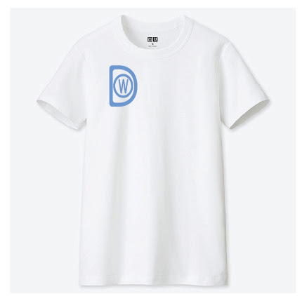
Figure 2.13 : White T-Shirt Collateral
Figure 2.14 : Expansion T-Shirt Collateral
Figure 2.15 : Paper Cup Collateral
Figure 2.16 : Animation Process in Photoshop
Figure 2.17 : Key Artwork GIF Animation
5. Instagram
Figure 2.18 : Uploaded Work on Instagram
Final Submission
Figure 3.1 : Self-Portrait
Figure 3.2 : Key Artwork
Figure 3.3 : Collateral 1
Figure 3.4 : Collateral 2
Figure 3.5 : Collateral 3
Figure 3.6 : Collateral 4
Figure 3.7 : Instagram
Figure 3.8 : Finals Task 2 Submission (PDF)
Feedback:
Week 6 General Feedback:
The logo that we are designing for our collateral must have a clear and legible, copying the wordmark and pasting
Week 7 General Feedback:
Certain parts in our collateral should be enlarge and the collateral can be made more interesting by zooming in one part of the collateral of not not showing the entire collateral.
Personal Feedback:
The Key Artwork must be the designer name or the word has to have a meaning.
Reflection
Experience
In the process of designing my key artwork and collateral I have experience
many different design style of key artwork that is use for cartoons,
advertisement, game, company logos and many more uses by other organizations
as well as individual. Learning and expanding my key artwork to further height
and also designing collateral with my key artwork give me great confidence in
myself as well as improving my design abilities.
Observation
From what I have observe in this assignment and exercise, I have learn a great
deal how design process of key artwork and collateral work as the first
process for creating our collateral is the key artwork as it support. During
assignment we are told to use our name to design both for our key artwork and
collateral where we learn the key artwork that we designing must possess a
meaning and also most importantly it have to readable.
Findings
What I have found in this assignment and exercise is that there no need for
key artwork to be very complex to it as simplicity is of the way to go
combining with a suitable color palate the design of the key artwork can be
very memorable to the audience who see it as that is important part in
designing a key artwork as I believe.
Further Reading
Figure 2.15 : Paper Cup Collateral
This book that is the basic form of introduction to typography where the
intention of this book are to get the beginning student of graphic design to
understands and demonstrate basic principle of typography where otherwise
complex meeting of message, image, and history that is typography have some
that is best in history texts are weak in examples as well as some of the
best theoretical texts speak more to the professional than the
novice.
The sequence of example in this book is built to demonstrate that the
character and legibility of type only exist in the context of voids- what
type designer Cyrus Highsmith describe as 'where type isn't'. A serious
typographer constantly monitors and manipulates the relationship of form
(where type is) to counter form (where it isn't). To understand this
relationship, it is essential to see type as progression of spaces (right).
Changing any one space immediately alters its relationship with all the
others spaces. Those of you familiar with Gestalt Principles will doubtless
find similarity to the concept of contiguity, continuity, and
closure.


Comments
Post a Comment